Wednesday, 14 July 2010
Friday, 9 July 2010
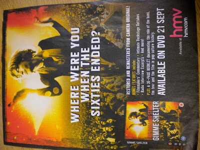
The Rolling Stones Magazine Advert...
 This is a close up of the DVD cover on the advert. It shows people what to look for in the shops.
 The advert also shows the date that the DVD is in store and the website for the store it's in.
 There's normally a punch line to attract the target audience. For example young children or older people.
 A picture of the artist is normally in the center of the advert to attract people's attention and allows them to be familiar with the new things they're releasing.
Steps DVD Case...

The inside of the DVD cover shows all the albums they have released over the years. This shows their success and shows their career highlights. It also shows the dates of their Gold tour which was their final tour. The music videos show what their tour would be like and what people can expect when going to see them live.

 The back of the DVD cover tells the audience what people can experience from the DVD by writing a blurb. It also shows a list of songs which you can watch the videos for and tell you how long each song runs. It also contains still images from each video show all the different members of the band. It also has a barcode, website and copyright information.
 The front cover has a picture of the artists in costumes related to the DVD title, 'Gold'. It shows all the members of the band has a clear title of the band name.
Wednesday, 7 July 2010
 This would be for our DVD cover because it shows the artists and the two main people in the video.
 It shows their costume they wore for the video and their movements and pose shows their personality which appears in the video.


We want this picture to be repeated along the binder of our DVD
Review
Genre Characteristics- Clothing matched the genre, different locations, dancing, hair and make up, bright colours.
Visuals/Lyrics- Lip syncing was good, didn't really reference the lyrics.
Visuals/Music- Dancing, flashing lights in time with the music, editing also in time with music- jumping between lips.
Need to sell artist- showed more than one ability by dancing, a lot of screen time for both artists.
Intertextuality- None
Voyeurism- Obejctification- close up on lips.
Analysis
Good lip syncing with the music, even though there wasn't too many lyrics but still a good job. (Y)
Dancing was synced with the music very well. Dance routine was really good, used all the space of the camera shot.
Changes of location was well done aswell, good transitions.
Extreme close-up was very good, the way they changed colour. Good use of voyeurism.
Genre is clear with use of costume, e.g. hats, clothes.
P3-12
P3-11
- Held steady shot
- Used variety of shots
- The material shot was appropriate to the task set
- Mise-en-scene was selected well -Costumes selected very well
- Editing was done cleverly especially with colour and black and white editing of the lips
- Used black and white effect
- Edited appropriately lip singing in time and really good.
- The music video fitted the genre.
- Visual music fitted with the video
- Sold the artist with costumes and dancing
Group P3-14 Evaluation
Overall we thought this music video was well suited to the genre and a good effort was made. It suited the genre as there was dancing and a performance in a distinct location. We liked how the props were incorporated in the video with the use of lights, hats etc. The video seemed fun and bubbly and fitted in with the song. There were jump cuts between the lights and the the performers which showed variety and this fits in with Goodwin's point about the visuals fitting in with the music. The close up of the lips in the song gives the viewer the pleasure of looking.
Subscribe to:
Comments (Atom)


